

The Folger Shakespeare Library
The Folger Shakespeare Library is an esteemed institution in Washington, DC that contains the most extensive collection of Shakespeare’s works outside of Stratford, England. In need of a new digital presence, the Folger hoped to refocus the site to address visitors. As the information architect and UX designer on this project, I managed and facilitated participatory UX activities with the Folger library’s team.
How might we accommodate the needs of many diverse audiences, with specific channels for visitors, students, teachers, and scholars who visit the Folger’s website?
the process:
The Folger struggled to balance the needs of their various audiences: in-person visitors, performance attendees, academic scholars, teachers and students, and benefactors. Previously, their website had functioned as an internal archive with little information architecture, which made effective navigation and exploration nearly impossible. Working with WDG, a digital agency in Washington, DC, I was responsible for completing comprehensive information architecture, leading UX research, and developing interactive wireframes. Tasked with distilling the site’s content into an experience users wanted and needed, we recruited team members from all departments and offices. By creating this co-creation group, we ensured that our solution met everyone’s needs.
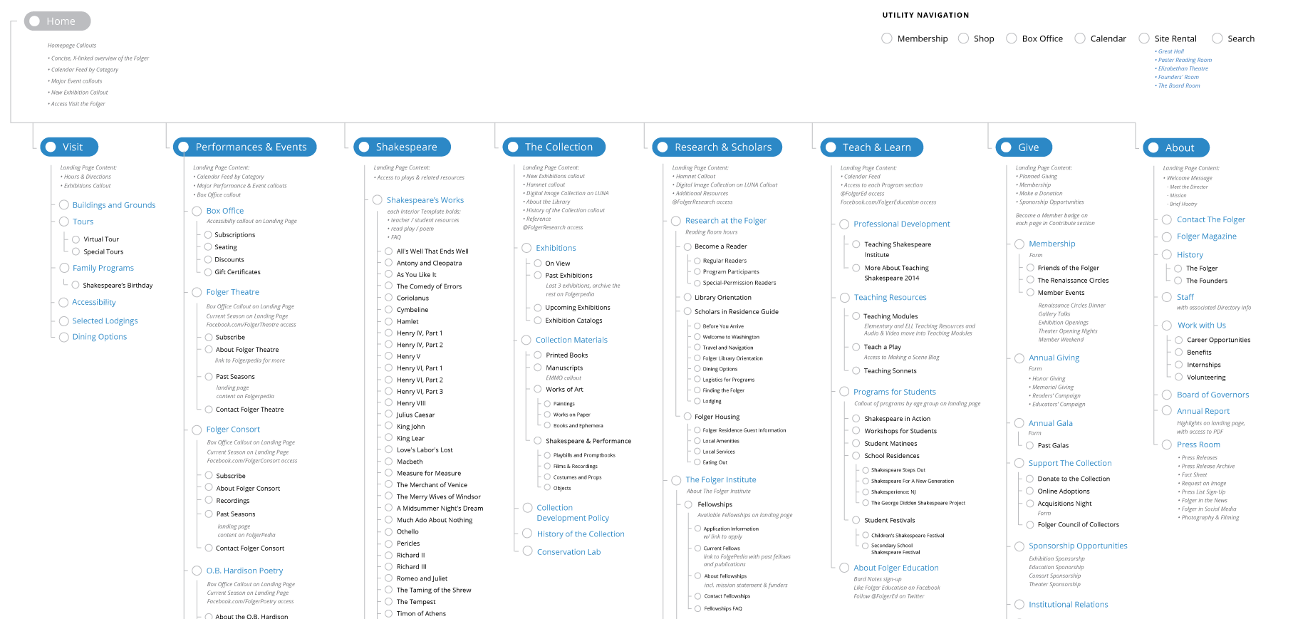
final sitemap
challenges:
How will users find what they need?
In the previous version of the Folger website, the content organization mirrored the complex network of teams and offices that operated within the library. Co-creation workshops helped define the primary categories of visitors to the Folger website. These categories became the basis for specific collections of information, tailored to particular audiences. They also formed the foundation for the new website’s primary navigation.
determined user paths

What is needed to reach a collective agreement?
Initially, there was disagreement and push-back against shifting the site’s overall purpose and dismantling existing archives of information. Using co-creation activities allowed every team to voice their needs and build in the nuances necessary to ensure that all visitors could easily find the content they sought. The congruence that resulted from this active participation allowed many members of the Folger team to take personal ownership of the final product, creating a sustainable future for our new system.
outcomes:
Our UX research sessions resulted in wireframes, co-created with the teams responsible for each section’s content. I designed the site from a mobile-first approach, bringing the Folger into the future with a responsive website. Using InvisionApp, I produced interactive, high-fidelity wireframes that we used to collaboratively design the experience and visuals with precision. The newly-integrated information architecture facilitates navigation, exploration, and discovery for all types of users who visit the Folger Shakespeare Library’s website and the resulting highly-intuitive experience directs users exactly where they need to go.
homepage
The Folger’s new homepage uses bold imagery from the Folger collection to call out major sections of the website as additional navigation for the many groups of users.
visit the Folger
The landing page to visit the Folger collects the basic information about location, hours tours, and activities available for visitors. In addition to various information about to to get to the library this page also provides information about restaurants and other resource around there.
shakespeare's works
The landing page for Shakespeare’s works collects access for William Shakespeare’s 17 comedies, 10 history, poems and a famous collection of sonnets. Created as a highly-trafficked resource for all visitors, it also connects to the user paths for students, teachers and scholars.